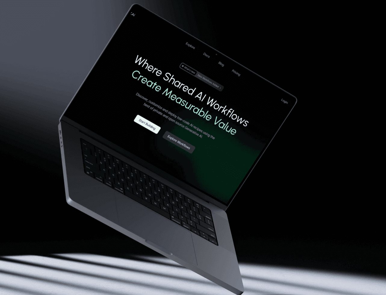
Streamlining Starbucks Mobile Ordering: Reducing Friction and Wait Times

Streamlining Starbucks Mobile Ordering: Reducing Friction and Wait Times

Streamlining Starbucks Mobile Ordering: Reducing Friction and Wait Times

Streamlining Starbucks Mobile Ordering: Reducing Friction and Wait Times

Streamlining Starbucks Mobile Ordering: Reducing Friction and Wait Times

Streamlining Starbucks Mobile Ordering: Reducing Friction and Wait Times

Starbucks Mockup Screens

Issues with Old Design

Issues with Old Design

- 73% dissatisfied with previous ordering experience

-80% faced difficulties customizing orders

- 65% reported issues with app loading speed

- 73% dissatisfied with previous ordering experience

-80% faced difficulties customizing orders

- 65% reported issues with app loading speed

Key Achievements

Key Achievements

1

Simplified flows to ease and optimize ordering

1

Simplified flows to ease and optimize ordering

1

Simplified flows to ease and optimize ordering

2

Conducted user surveys to uncover pain points

2

Conducted user surveys to uncover pain points

2

Conducted user surveys to uncover pain points

3

Conducted user surveys to uncover pain points

3

Conducted user surveys to uncover pain points

3

Conducted user surveys to uncover pain points

Workflow

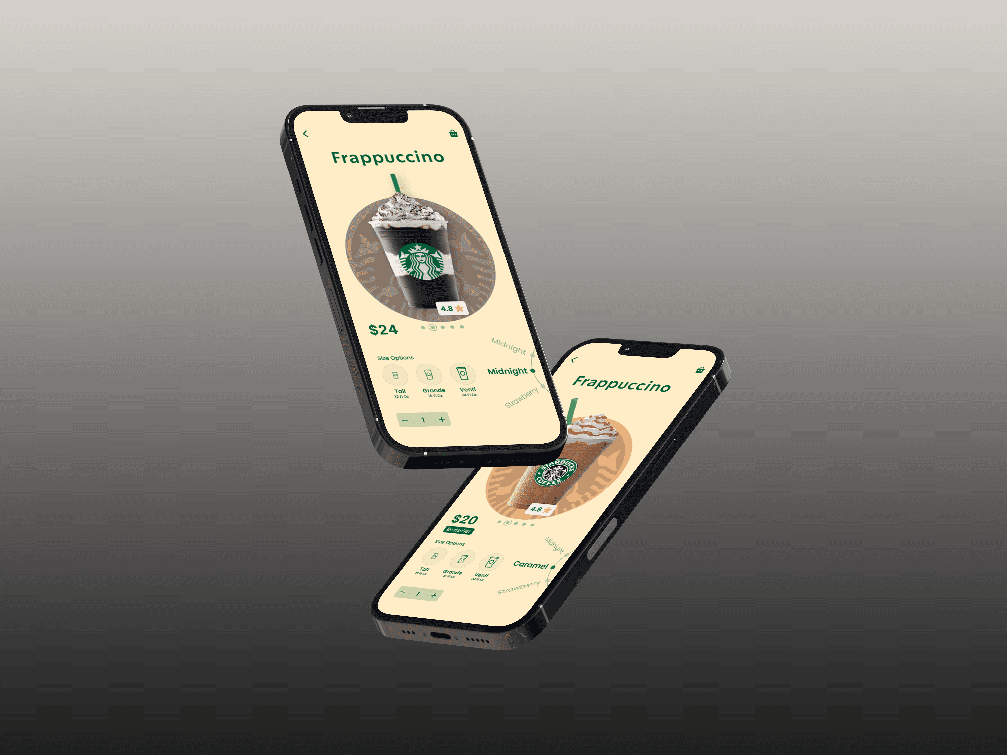
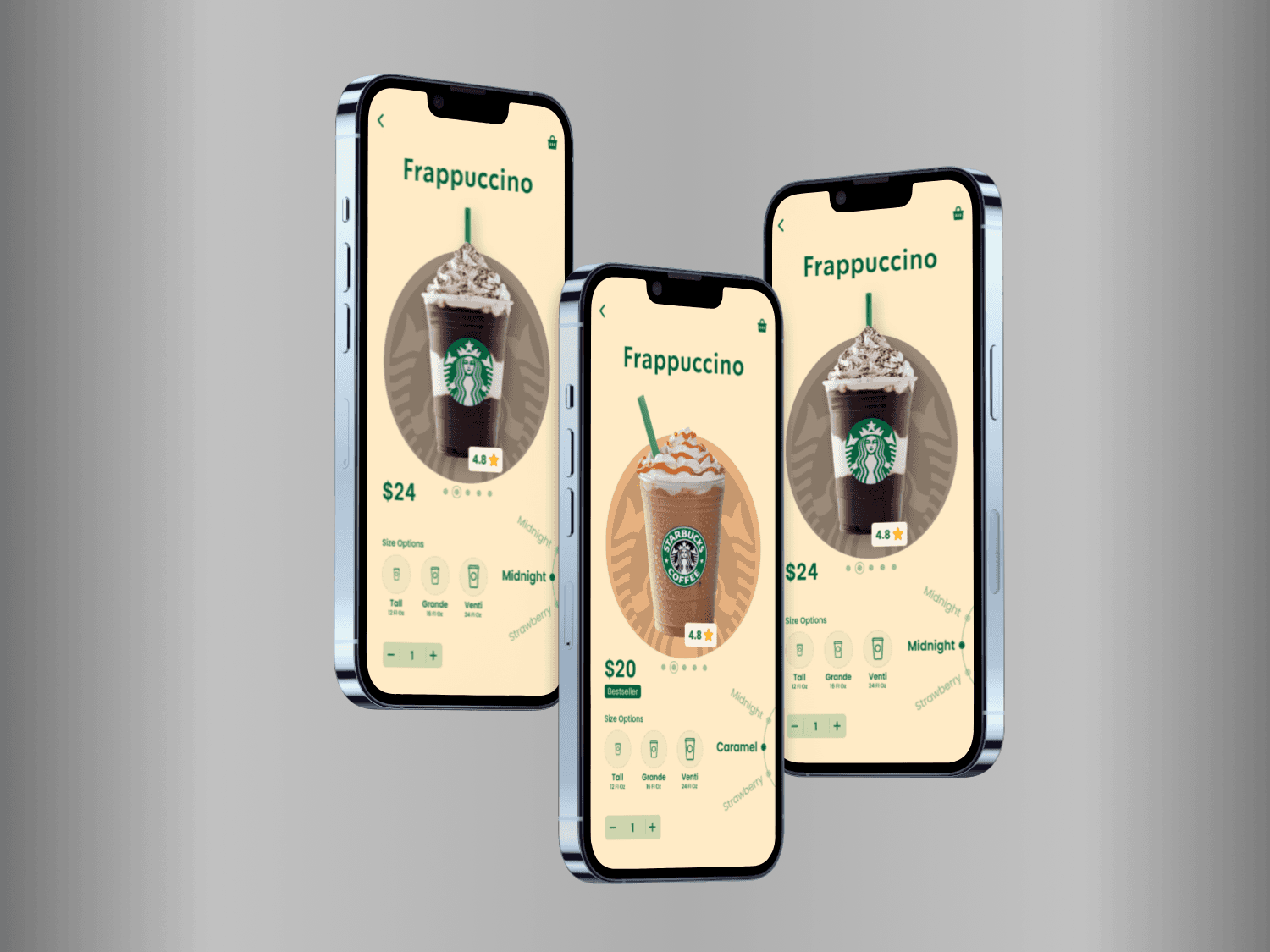
With its robust physical presence, Starbucks sought to optimize its digital experience by revamping its mobile app. User research revealed opportunities to improve enjoyment, customization, and performance.

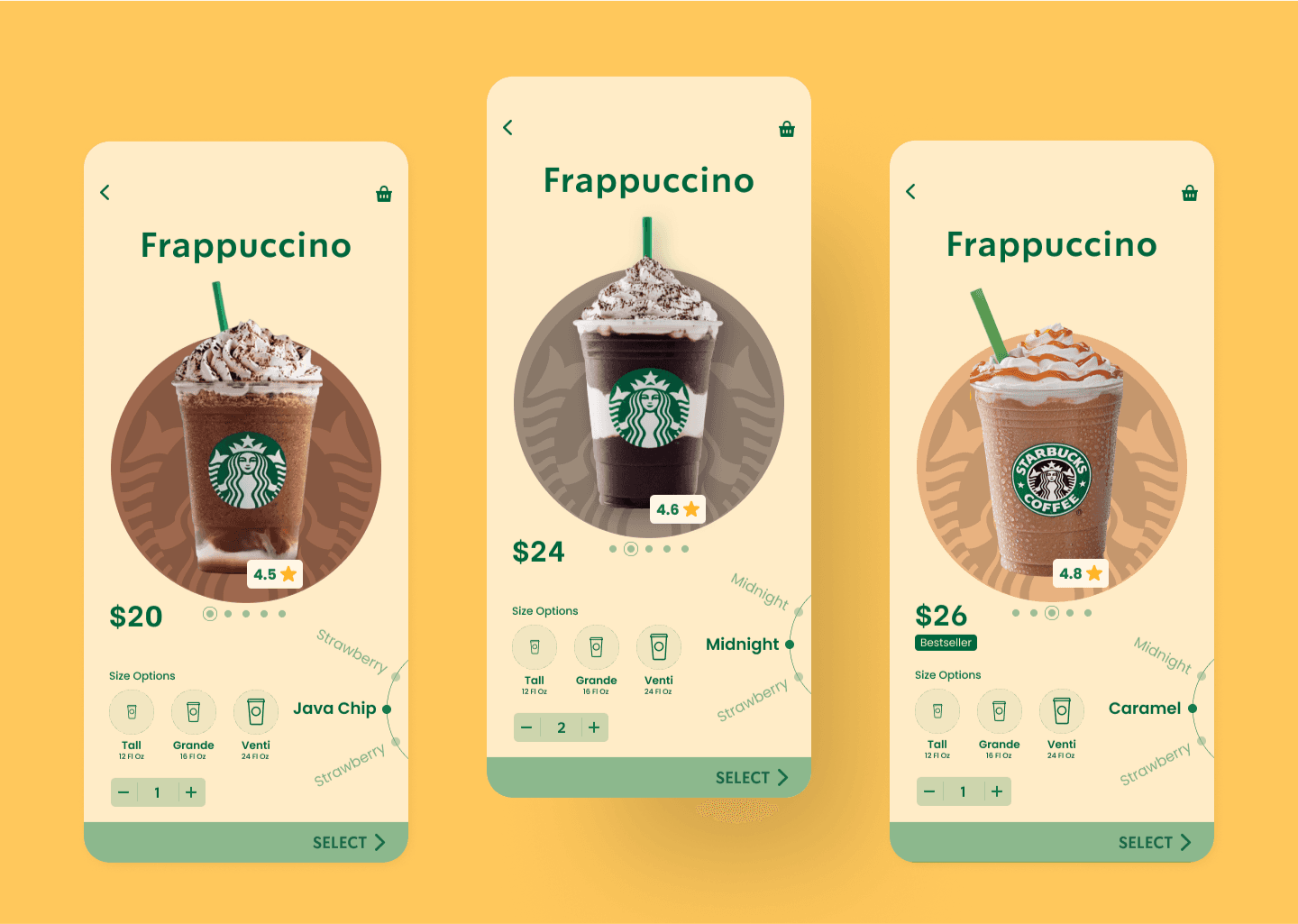
By stripping away clutter and honing in on key tasks, I helped craft an intuitive user flow that makes ordering coffee seamless and enjoyable. The decluttered interface provides clarity while retaining personalization.

Each design decision aimed to carry Starbucks' commitment to quality from its physical cafes into the digital realm. My priority was crafting an experience as delightful as that perfect handcrafted latte.

Starbucks Redesign Screens

Design Principles

I prioritized user-centricity, visual coherence, intuitive navigation, clear information display, and touch-friendly interaction throughout the app design process, ensuring a seamless and enjoyable experience.

Conclusion

This redesign affirms that utility and enjoyment need not be mutually exclusive. By balancing simplicity with personalization, Starbucks is taking strides toward a digital platform as flavorful as its coveted brews. For me, this project reinforced that design is about connection. When we remove obstacles and optimize for delight, technology becomes less transactional and more experiential.

Interested in exploring the complete Figma Design file, Adobe After Effects file and going through the project details? Schedule a call with me below.

Interested in exploring the complete Figma Design file and going through the project details? Schedule a call with me below.